Singin’ those nameplate blues


Let me tell you, I used to absolutely despise this thing:
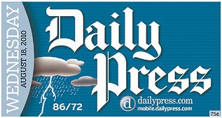
Wednesday, August 18, 2010


The Chicago Tribune’s old nameplate, reversed out of a big mess of cyan, seemed like it was one of those unfortunate “Let’s do this because we can” relics from a time when newspapers first gained the capability to print color every day, wherever and whenever they could. You know, like these guys:

But then a funny thing happened in September 2005. A British newspaper, The Guardian, rolled out a redesign that drew heaps of praise from most visual folks. One of the hallmarks of the front page: a blue-reverse nameplate:

As far as reverse nameplates go, this one is a lot more sophisticated, with a richer blue and updated typography, right? It looks good. Better than the Tribune, to be sure. But little did we know: It would open the floodgates of blue-reverse nameplates.


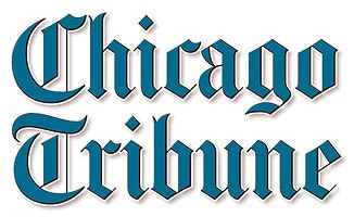
Although the Tribune updated its nameplate around 2002, the improvement was marginal, in my opinion. Granted, the color mix was better, but it still seemed gimmicky. At the time, retro was all the rage in newspaper design, and this nameplate certainly wasn’t retro:

And what’s going on in Chicago these days? You’ve probably guessed by now. The reverse blue bit the dust in the paper’s 2008 redesign.
One of the first was the Kansas City Star, which went blue in a redesign launched in June 2006:

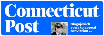
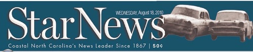
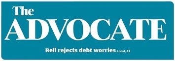
Like the Guardian makeover, the Star’s redesign was favorably received. So we had two well-regarded redesigns, both with blue-reverse nameplates. From there, the blue tide rose quickly (shown here in no particular order):
© Scott Stoddard, all rights reserved | Drop me a line
I don’t do Facebook, but you can follow me on Twitter.
Intrigued? View my LinkedIn profile.
